Illustration guidelines
The illustration guidelines are intended for use by trained graphic designers and illustrators developing bespoke content for courses delivered at the University of Adelaide.
Template files
There are a number of template files and packages to use within the Adobe Creative Suite tools.
Click here to download.
Key graphics
Flat art
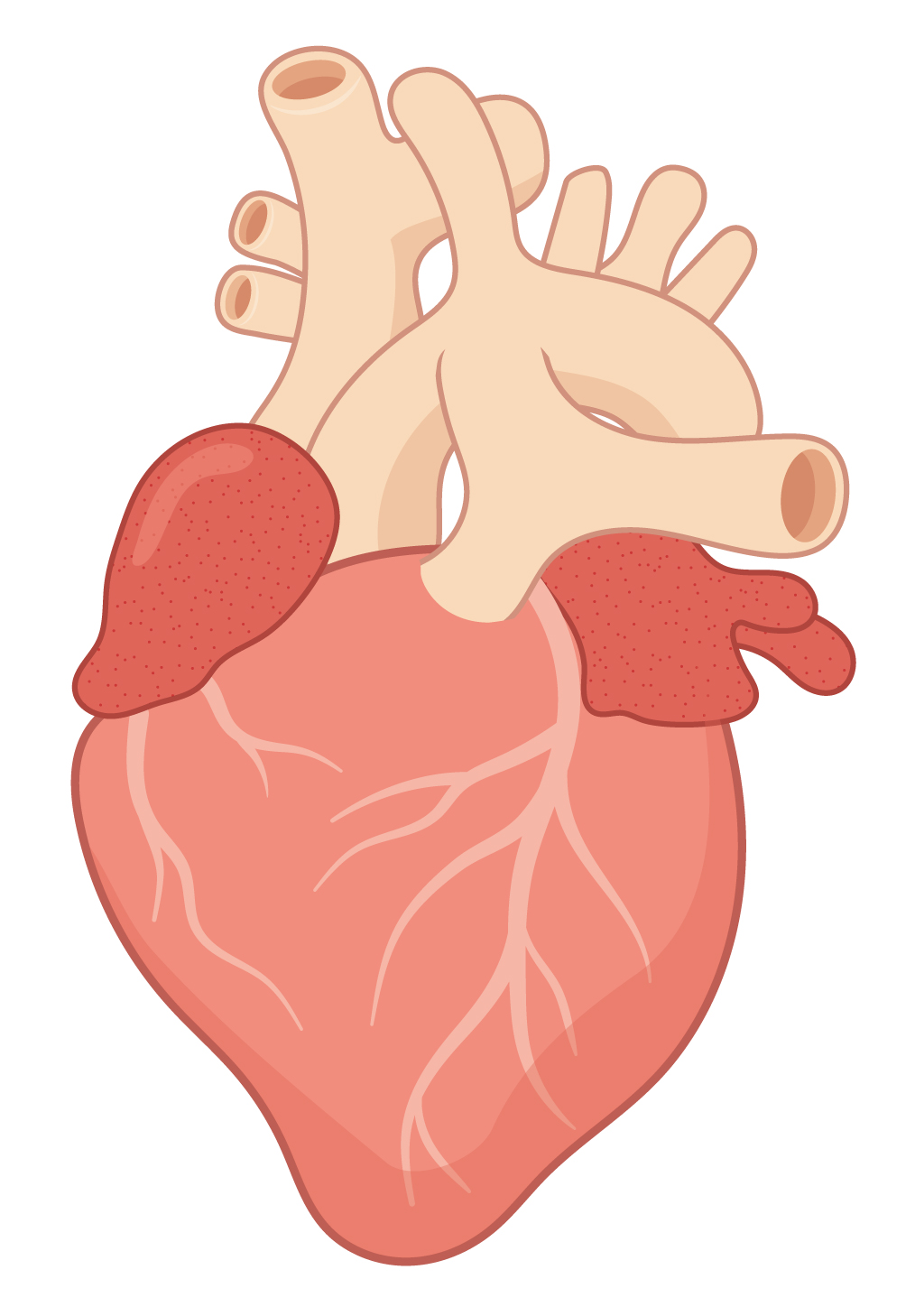
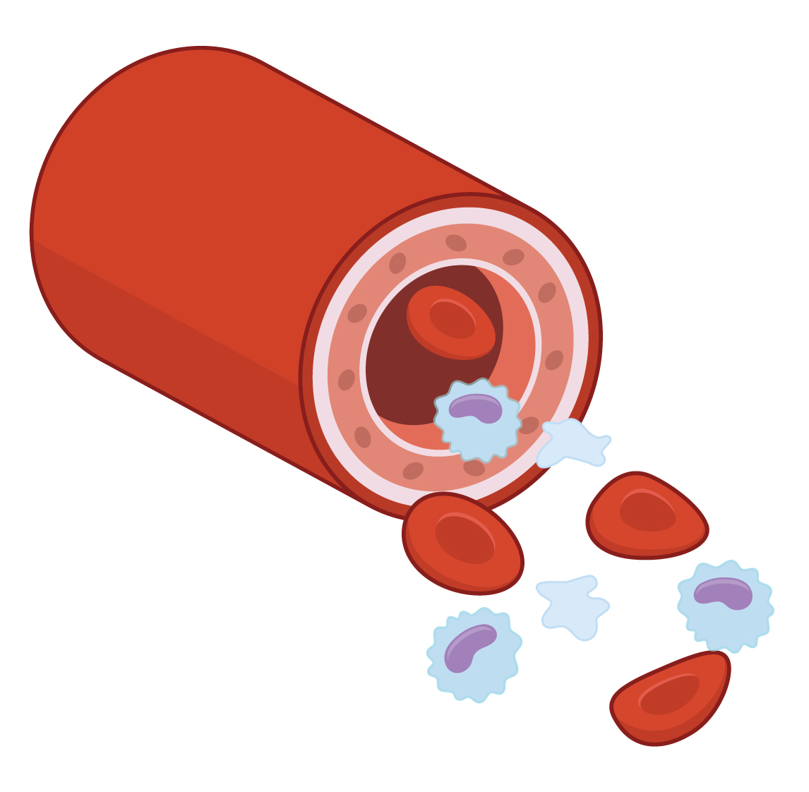
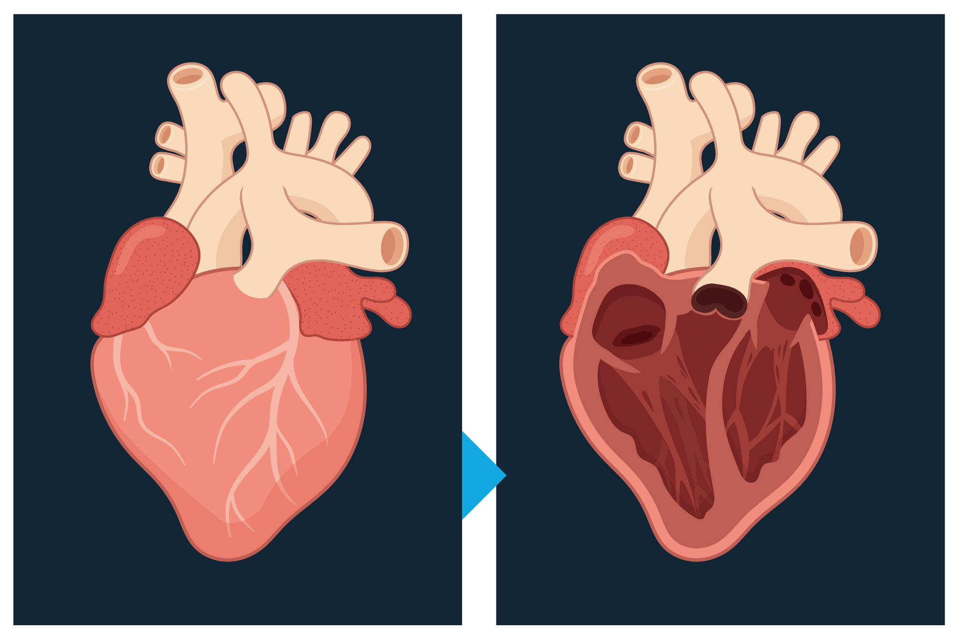
The flat art style is moderately stylised, using selective coloured outlines and consistent line weights it utilises simple textured patterns as a piont of interest. These images can be iconic in colour and leverage highlights and shading in Adobe Illustrator or similar.
The flat art style is relatively simple to illustrate.
Realistic art
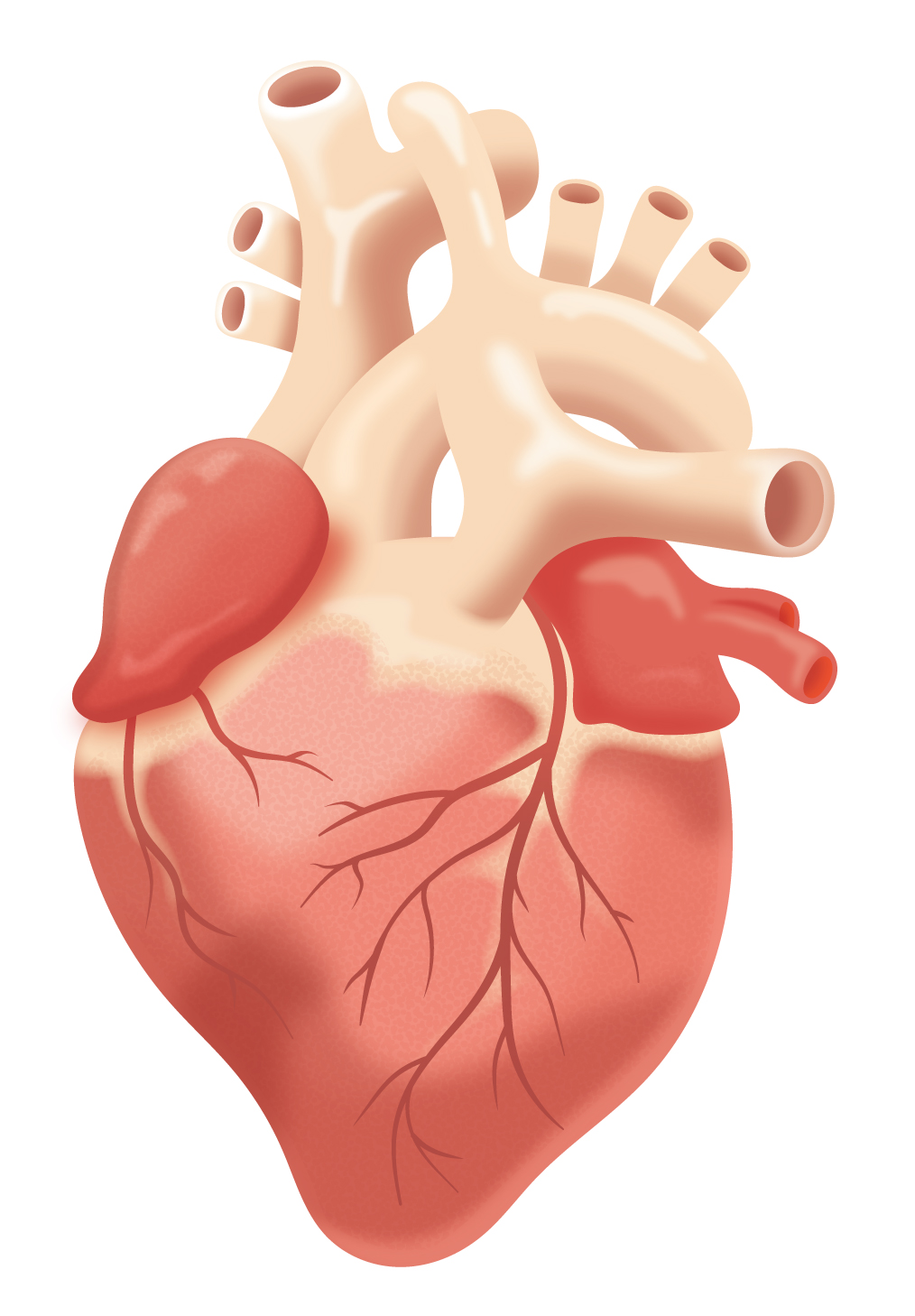
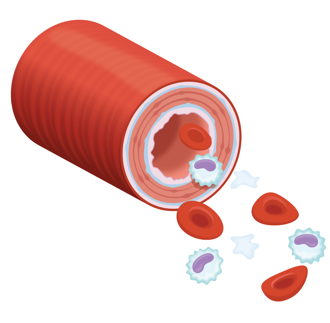
The realistic art illustrations are intended to display as realistic as possible, without outlines it utilises textures and patterns to add realism. Diffused highlights and shading give the illustrations depth, this style is used when anatomical accuracy is required.
The realistic art style is moderately complicated to illustrate.
Symbolic art
Symbolic art is a simplified style which can be used to display more complicated or detailed objects. This style is useful when microscopic or fine detail is required.
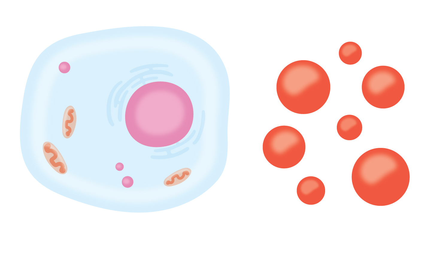
Level of detail
It is important to simplify detail where it would otherwise be lost at scale. For detail that appears within an animation, consider reducing the level of detail if the illustration or image appears only breifly, instead, invest more time in adding detail to artwork that is the focus of any animation.
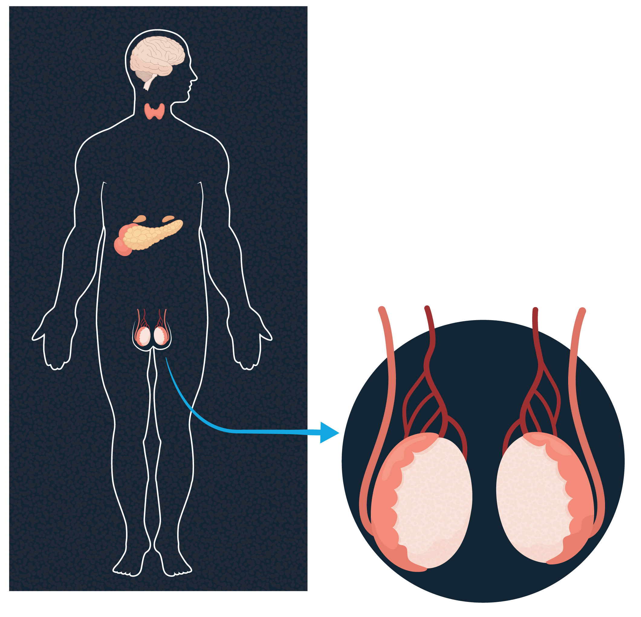
Layering
Where feasible, art can be created with layers to assist in visualising complex objects like anatomical organs or systems. By creating a clipping mask over the artwork, this ensures exported asset dimensions are identical which assists during build and animation.
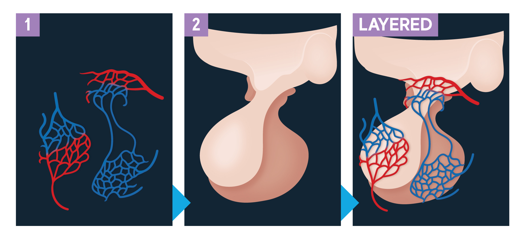
Cross sections
Layers can also be utilised during animations using opacity and other transitions to create cross sections or splices of an object.
The human form
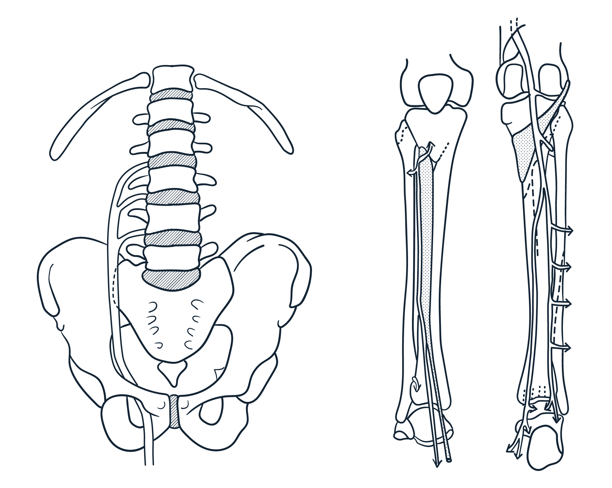
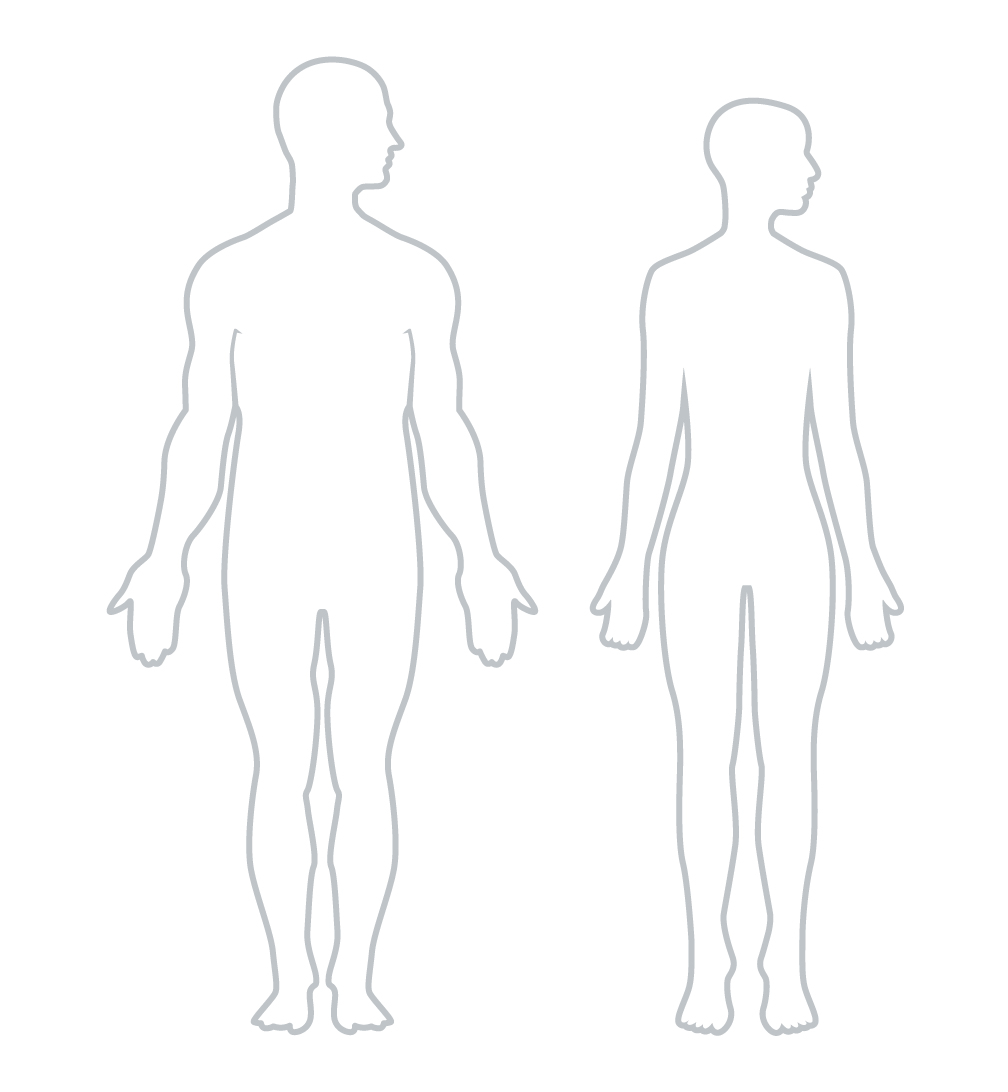
Where possible, use basic line art to represent the human form. The Univesity brand navy colour should be used and terminating edges should taper. Ensure to balance the use of gender representation where relevant and practical.

Line drawings
When drawing or tracing, use calligraphic brushes with pressure sensitivity (when using a tablet and pen). Line art should use the University brand navy colour at 2pt round with pressure variation of 2pts. For texture/relief options, use the line pattern swatches provided in the template.
