Data visualisation
The data visualisation guidelines are intended for use by trained graphic designers and illustrators developing bespoke content for courses delivered at the University of Adelaide.
Template files
There are a number of template files and packages to use within the Adobe Creative Suite tools.
Click here to download.
Before you start to create data visualisations, its important to remember a few key principles which will ensure the graphic intent is accessible and understandable by all students.
- Do not rely on colour as the only form of identifier, unless colour is use elsewhere within the page or resource, or where catagorial colours are required (eg. a scatter plot)
- Ensure all axis', axis titles and bars are labelled correctly
- Sort data by metric (high to low, most to least) unless sorting by date
- Use "multiply" blend mode for plots where values overlap
- Where possible, include support for zooming, scrolling and resizing charts for readibility
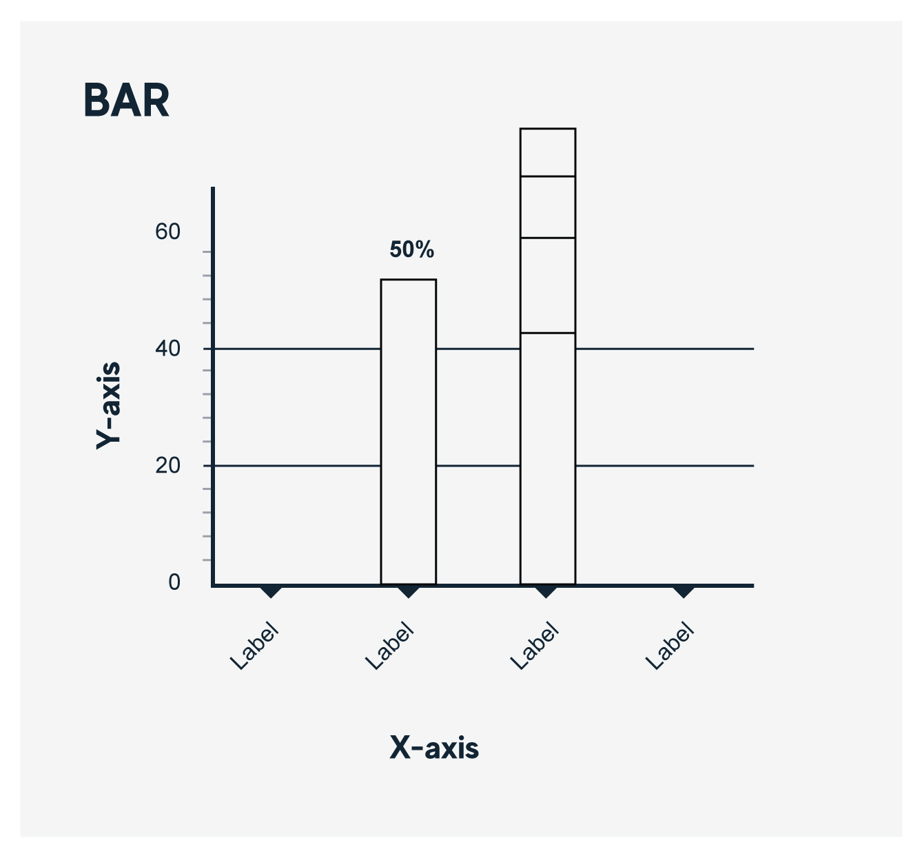
Bar and Column graphs
Bar and Column charts are used to compare different values that are hierarchically equivelant - ensure that each bar length is mapped by an equivelant metric.
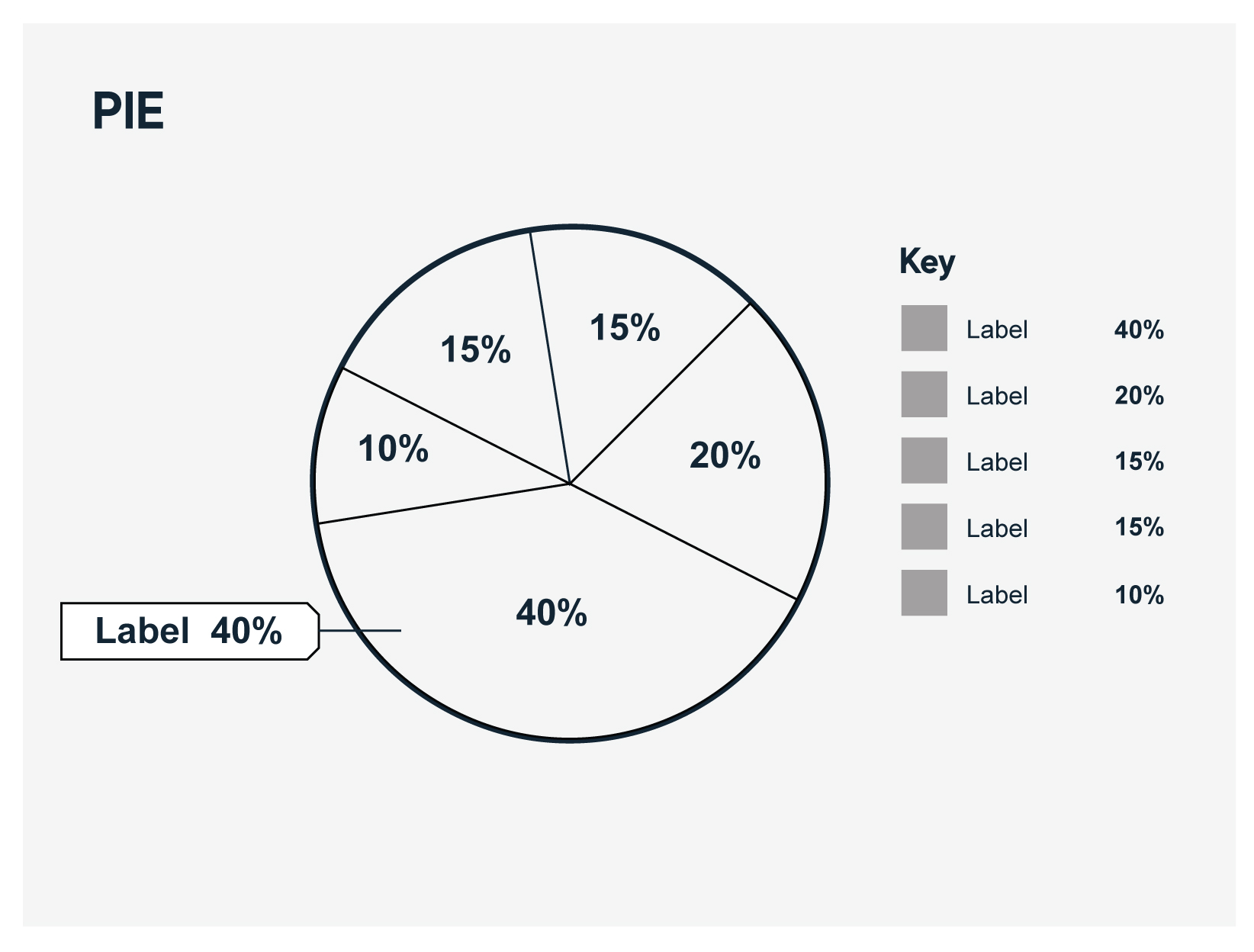
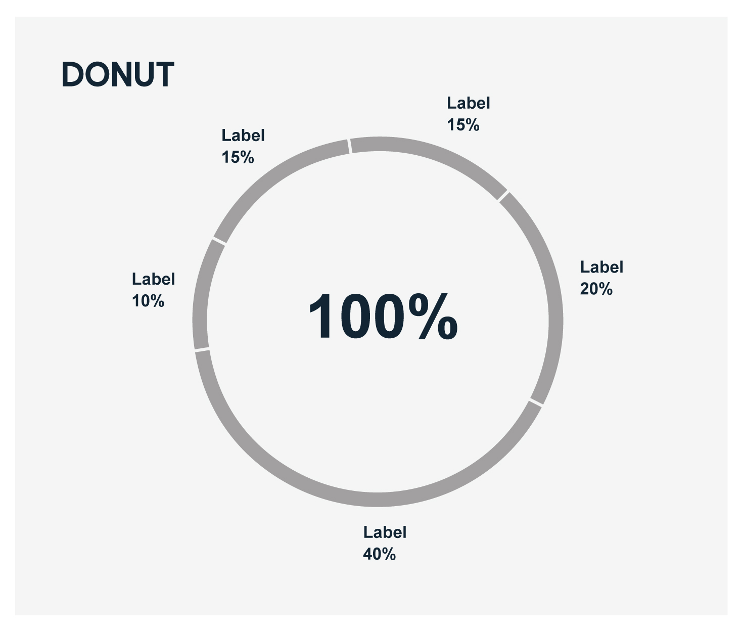
Pie and Donut charts
Pie or Donut charts are used to compare proportions of a total amount, each segment of the chart is mapped to the same dimension and metric.
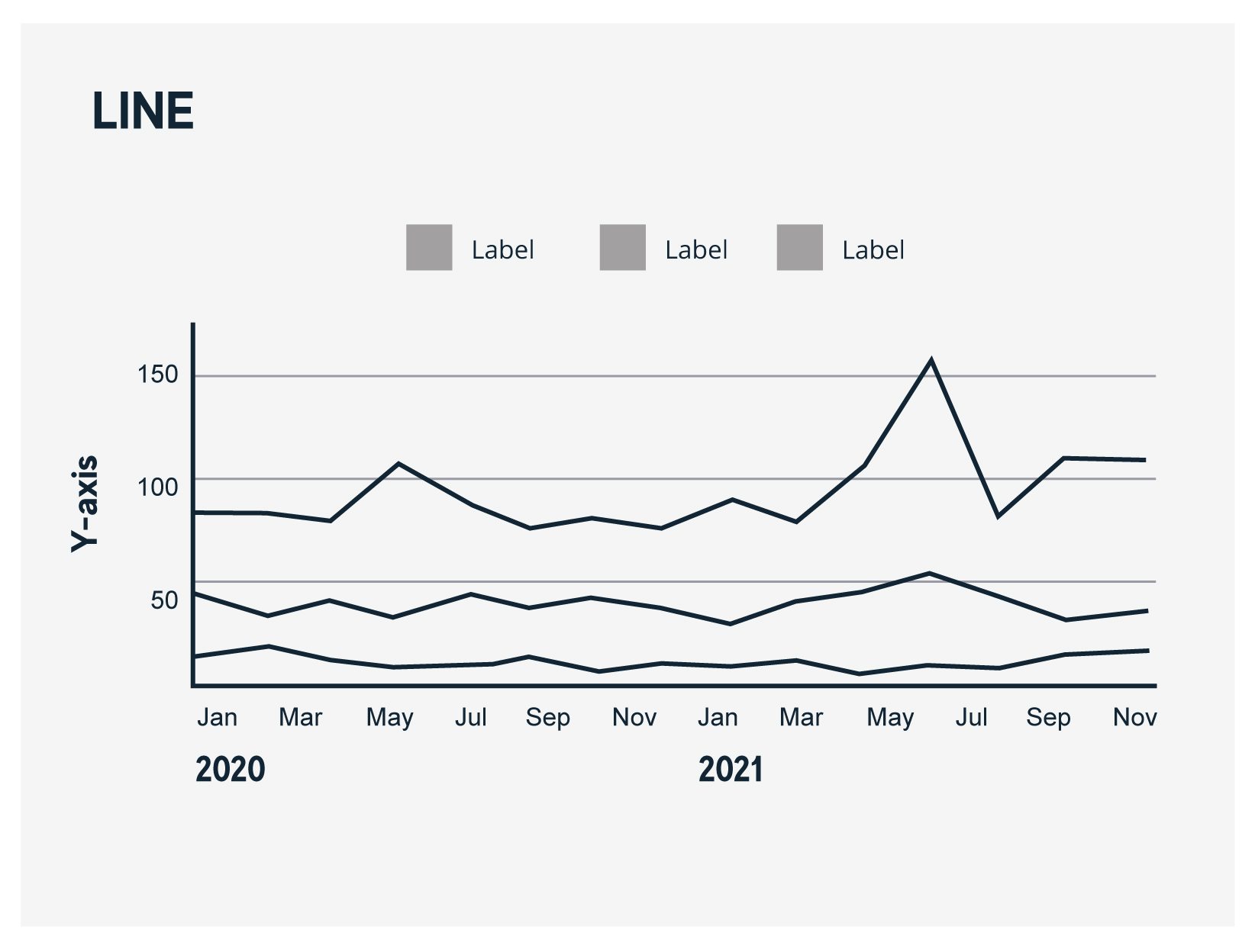
Line and Area graphs
Line and Area charts can be usedd to illustrate change over time and can be useful for displaying chronological data. Area graphs in particular have the added dimension and can be stacked to show differences between values and trends.
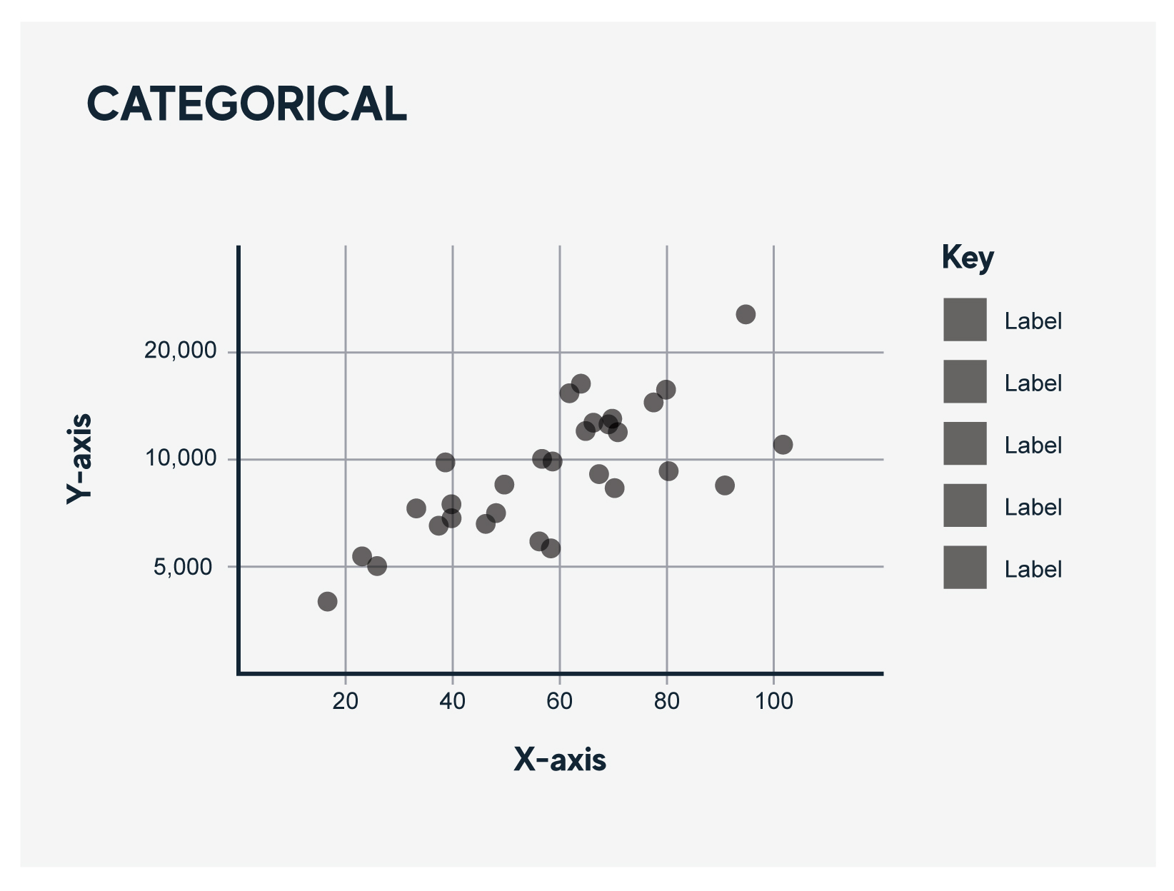
Scatter plots
Scatter plots are used to compare the relationship of many items across two metrics.
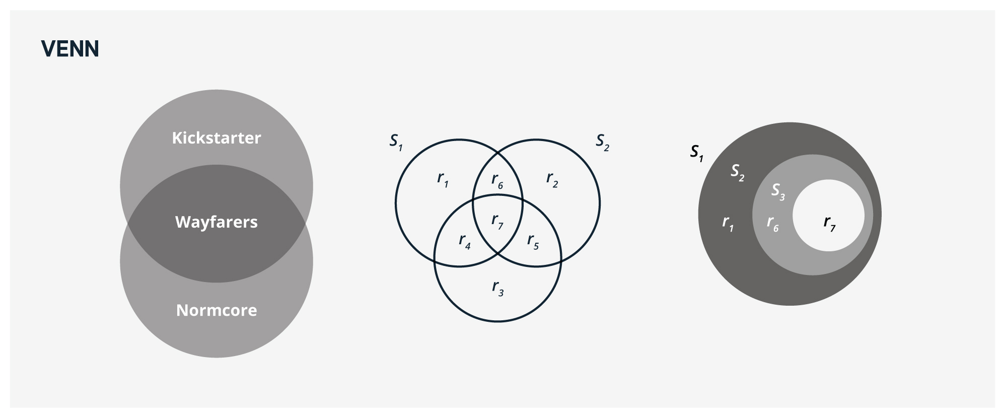
Venn diagrams
Venn diagrams are useful to demonstrate the relationship and overlap of multiple items. The area where two ore more items intersect show the shared or common traits of those items.
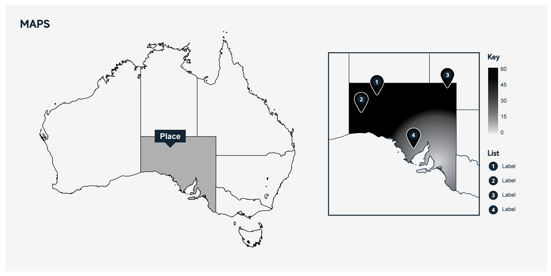
Maps and heat maps
Maps should be geographically accurate but simplistic in nature and draw focus to the data being represented.